The challenge
Connect the forecast to an operational decision.
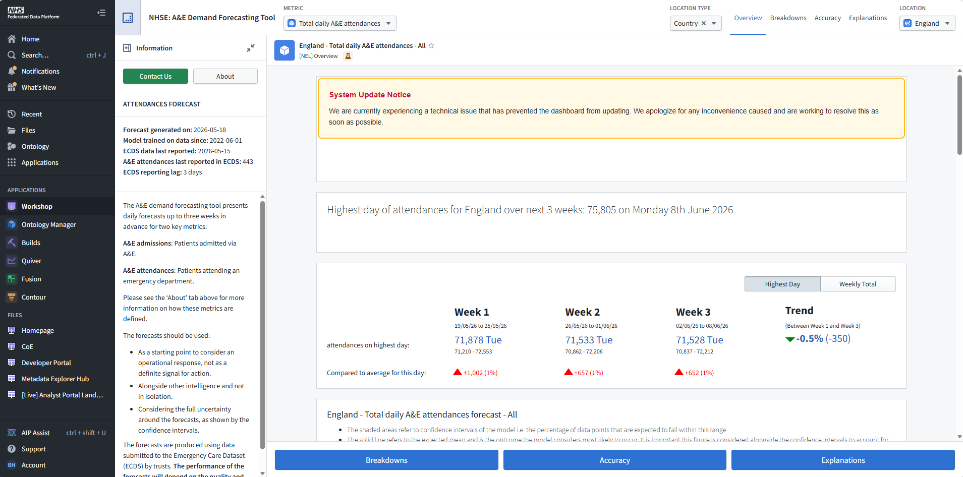
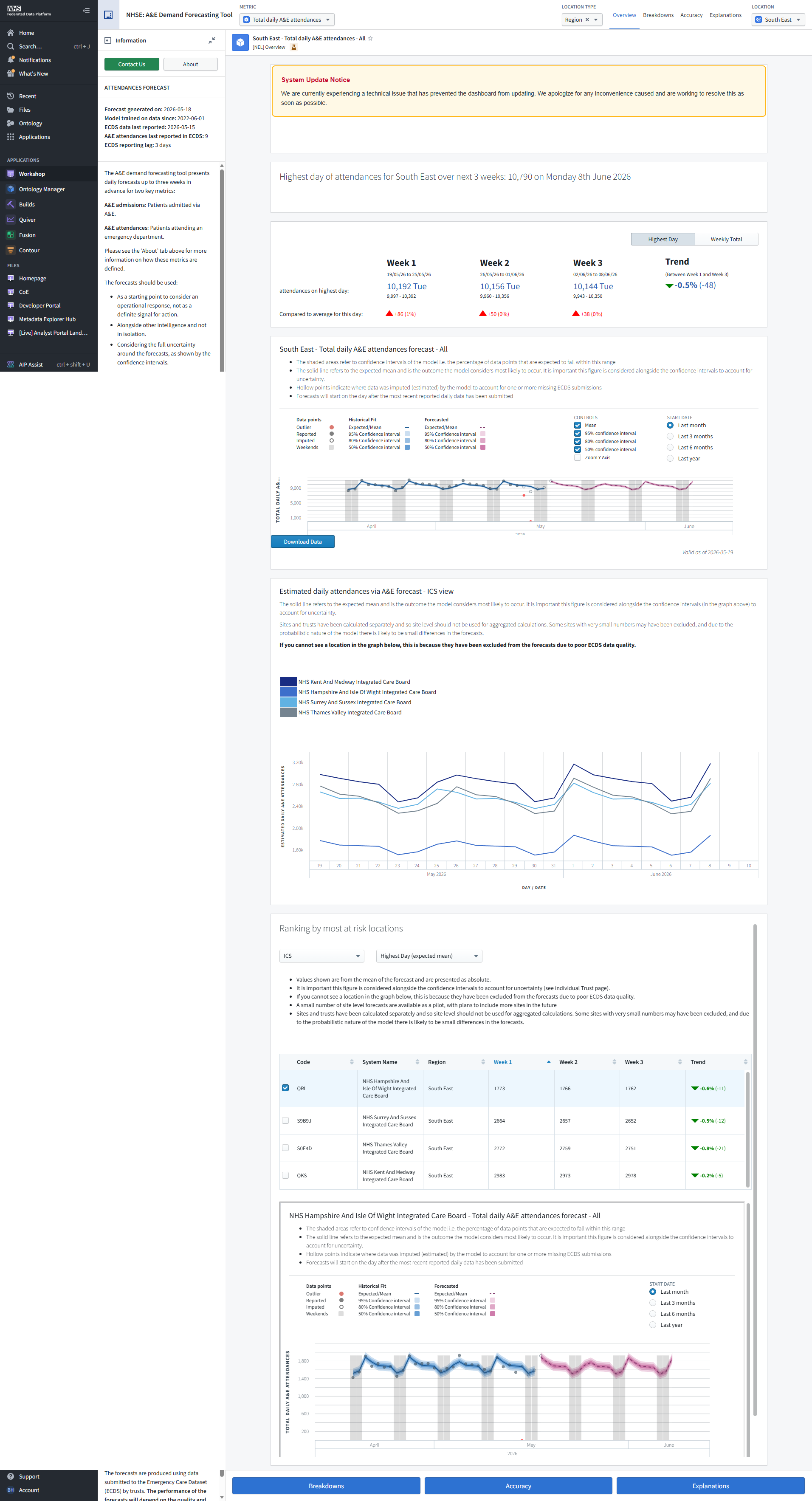
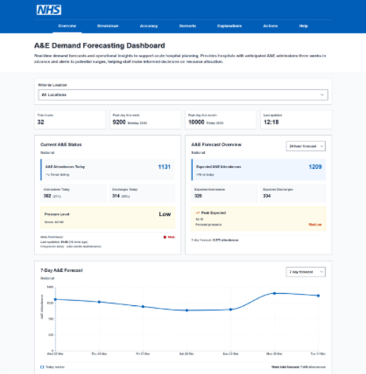
The A&E Demand Forecasting Tool forecasts attendances up to 21 days ahead, with trust, ICB and regional views. The model was already producing forecasts. The interaction challenge was how people interpreted the information for staffing, capacity and escalation planning.
Analysts and operational users needed different levels of detail from the same forecast. A single interface hierarchy could leave operational users with too much to interpret and analysts with too little to investigate.
My contribution
Bring planning behaviour into the design.
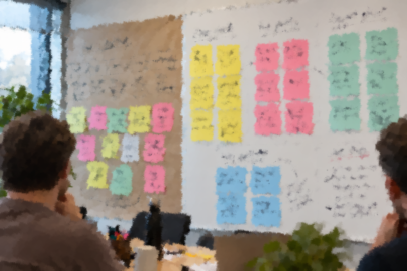
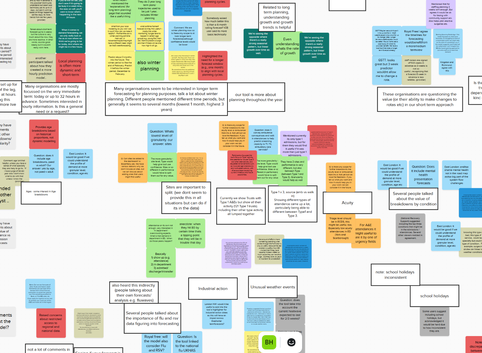
I reviewed the live product, worked with trust and regional users, and brought together research with a user researcher. The research brought together synthesis of fifteen interviews alongside prior research, working groups and observation of a trust planning with the tool.
I translated the evidence into design routes, information hierarchy and handover recommendations. The work involved researchers, developers, data scientists and product colleagues, with design decisions shaped by both user needs and platform constraints.
Prototyping and GDS principles
I use the GOV.UK Prototype Kit and NHS Prototype Kit to explore accessible interactions in code. GDS Service Standard principles inform my approach to user needs, iterative design and joined up services.
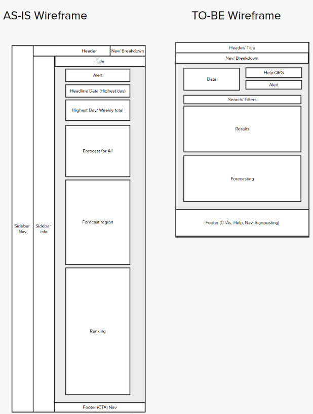
For A&E forecasting, this supports exploration of information hierarchy and clear routes through complex data, alongside the constraints of the live Palantir Foundry Workshop product.
Research into decisions
Make the meaning visible before the detail.
The research themes included trust, direction of travel, planning timescales, comparison and context. I connected those themes to specific interaction choices.
| Evidence | Design direction |
|---|---|
| Users needed to understand how wrong a forecast might be. | Show a range and bring the accuracy record alongside the forecast. |
| Rising or falling demand mattered more than an exact figure. | Lead with direction in plain language, then provide the numbers. |
| Rota decisions followed a different rhythm from the model. | Organise views around when operational plans could still change. |
| Analysts and operational users needed different detail. | Prioritise the operational summary, with detail available beneath it. |
Design judgement
Reconsider a popular status indicator.
Users liked a red, amber and green status concept in testing. I removed it because the colour could be interpreted as a definite answer while obscuring the range behind the forecast.
The lesson was to assess the behaviour a design encouraged alongside stated preference. Communicating uncertainty mattered more than making a probability look like a simple status.
Constraints and accessibility
Support interpretation within Workshop.
The work took place in Palantir Foundry Workshop, with a constrained component set. I documented structural limitations and fed them back to the platform team, alongside the design routes prepared for handover.
The design direction carried meaning in text and shape as well as colour, and considered text summaries and table routes alongside visual charts. Accessibility review informed the work. A next step would be to test these routes with disabled users.
Outcome and reflection
An evidence based direction for the live tool.
I delivered research synthesis, concepts and recommendations for trends, uncertainty, comparison and planning horizons. The handover combined research, accessibility findings and design routes.
Use and model accuracy can be recorded, but neither establishes that a forecast changed a staffing or capacity decision. That measurement gap is the next question I would prioritise.
How the evidence changed the design
A closer look at the status indicator decision, drawn from the project’s research and design direction.
- The starting concept
A traffic light status offered a quick visual summary. Users liked it in testing.
- The design risk
A colour could be read as a definite answer even when the forecast contained a range of possible demand.
- My decision
I removed that concept and prioritised direction, a visible uncertainty range and access to the accuracy record.
- Delivery and next validation
This direction formed part of the design handover. The next test should check whether users can explain the range and use it in a planning scenario.
My judgement within the team
I connected operational research with the constraints of a statistical model and the Workshop platform. My responsibility was the interpretation and interaction design, working alongside the researcher, data scientists, developers and product colleagues.
The traffic light decision shows where I challenged a preferred concept. The handover brought research, accessibility findings and design routes together so that delivery discussions could address the meaning of the forecast as well as its presentation.
The principle behind the work
Help people understand both the value of a forecast and the limits of its certainty.