The challenge
Connect referrals, records and service visibility.
The service needed to manage referrals, support appointment booking and help professionals see relevant patient information. The design also needed to make the wider pathway visible across the people and teams involved.
My contribution
Understand the service before designing the screens.
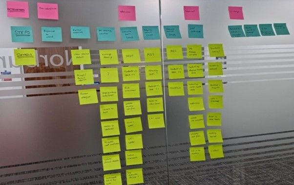
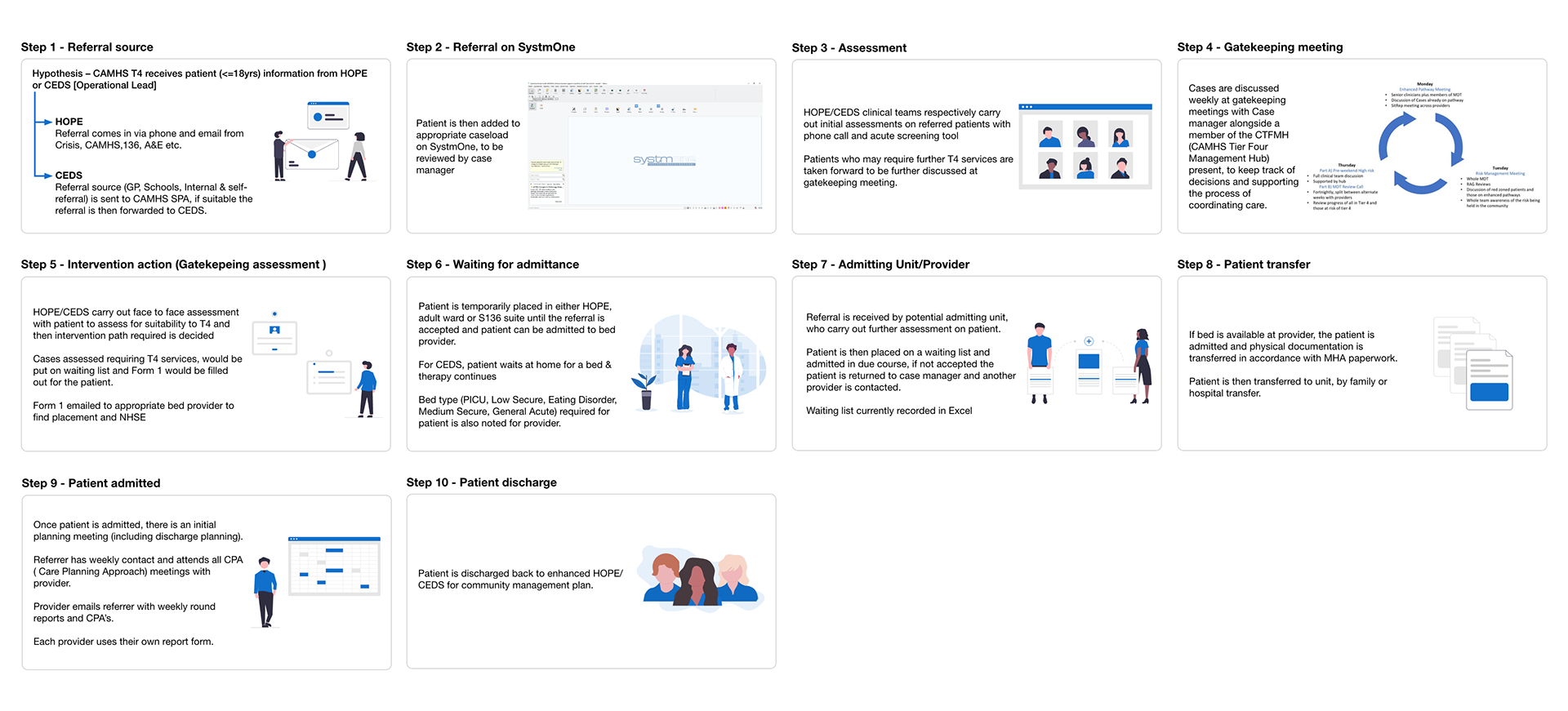
As a UX designer, I conducted research, created design artefacts and led testing and design activity. I worked alongside researchers and other designers, using service documents, stakeholder mapping and interviews to understand the existing pathway.
From research to design
Use the pathway to organise the product.
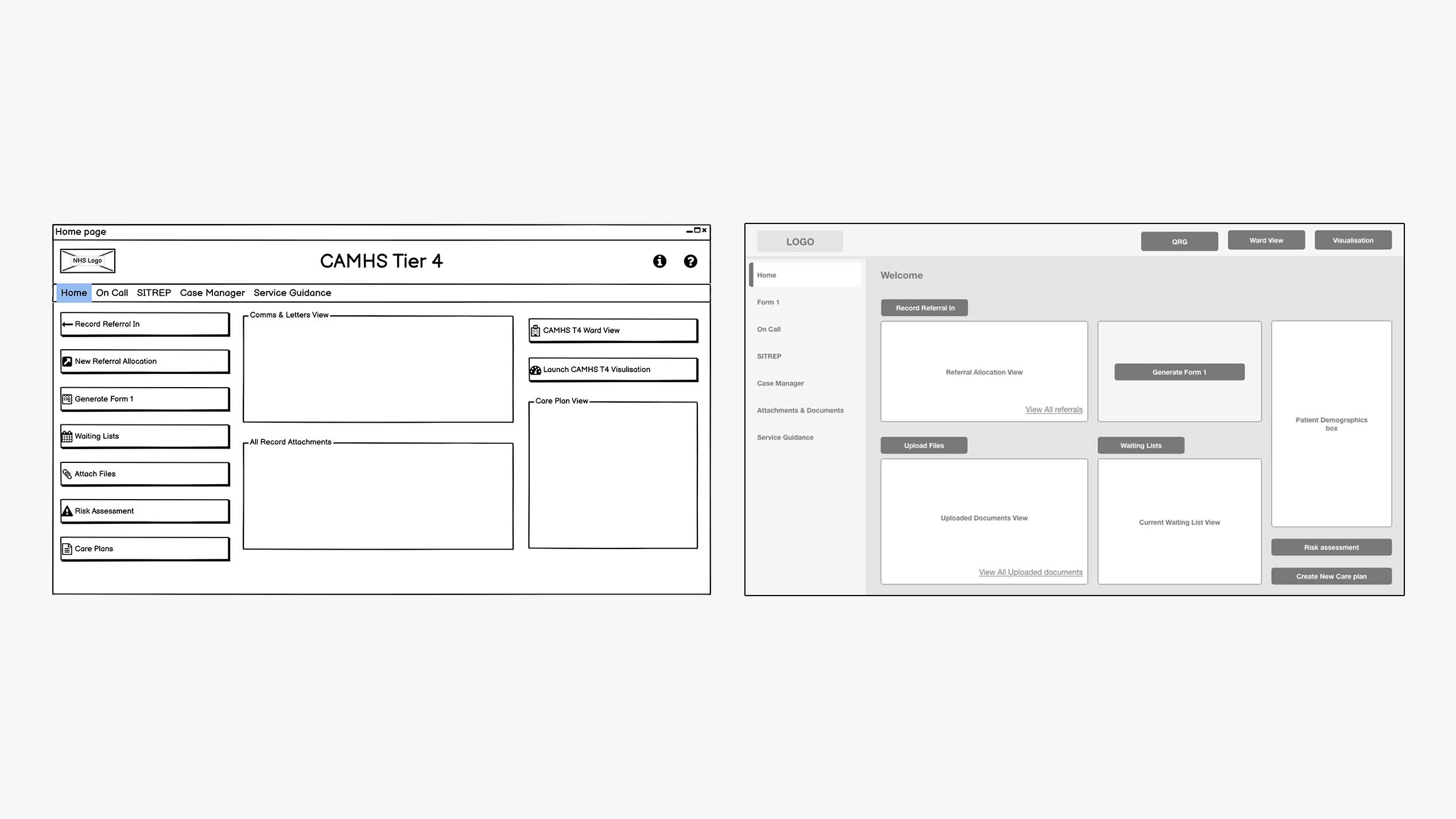
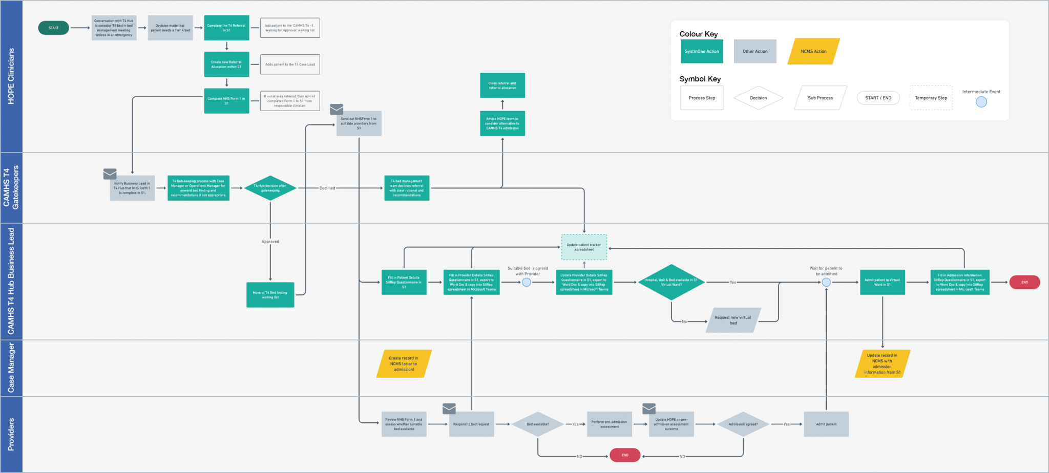
I used current and future journey mapping to explore where a digital solution could support the service. Low fidelity wireframes and clickable prototypes helped the team discuss requirements, navigation and the relationship between different screens.
Testing and iteration
Observe people using the service.
I ran individual testing sessions remotely and in person. During user acceptance testing, service staff worked through tasks while issues were logged and used to improve the product before release.
What the work produced
A connected set of service touchpoints.
The work covered referral, appointment booking, patient information and dashboards showing service demand. My contribution covered research, design and testing before release.
Read the pathway evidence
Compare the existing pathway with the proposed lanes for clinical teams, hub staff, case managers and providers. The design connects referral, assessment, admission and discharge rather than treating each screen as an isolated task.
I translated that understanding into wireframes and prototypes, then ran remote and in person testing. During user acceptance testing, service staff worked through tasks and issues were logged for improvements before release.
The principle behind the work
The pathway was the starting point. The interface followed the needs of the service.